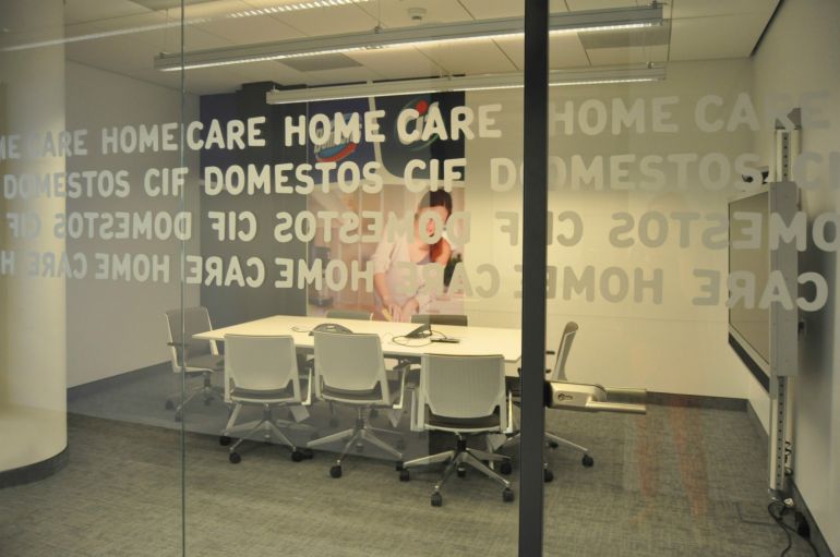
The main task of Advertis Group was to create area which will be an inspiring place having an influence on improvement in the quality of life concerning its employees. The work comfort was one of the factors which induced the company to removal. The proximity to the city center, hubs as well as service infrastructure available in the building let us to believe that the removal was a right choice – says Jakub Zieliński, Office Coordinator & Project Implementation Specialist in Unilever Poland.
Lightness of from
The interiors in the office were dominated by light materials – a glass covered with graphics, white corian and photograph wallpaper presenting certain brands which are the members of the concern. The leitmotif is a blue coloring which characterizes all elements that mark hubs. In case of such a large area and developed structure of the company, the compilation of visual identification system is an extremely complicated and multistage process – comments Paweł Gardasiewicz, Chairman in Advertis Group. The international and corporate SIW needs to be confronted with local resources and needs of employees. Then, the final aspect concerns creative solutions – work over form.
Open space +
Unilever company consequently chose the arrangement of area in open space conception. Therefore, it was necessary to determine thoughtfully some paths which are covered by employees. The applied set enables communication between workers, however, it requires special solutions which prevent from information noise. Moreover, some areas were separated in registered office like for instance relaxation zones, softened rooms for individual work, conference halls and kitchens, as well as share desk stands – which differ from open space areas – intended for guest employees and people working in a mobile way. The arrangement of the area is closely adjusted to the character of Unilever company.
The division of area, which is not pointed by walls, opens big possibilities for design solutions which depart from a common imagination concerning office not only in respect of its performance standard and facilitations for employees but also decoration. We spend a great part of our life in work. Therefore, it is worth taking care about friendliness in this place. The functionality should cooperate with aesthetics. When we work in comfortable conditions, we feel more appreciated, we identify ourselves with employer more easily and we want to be a part of his success – points out Monika Gardasiewicz, Art Director in Advertis Group.
The employees pay more attention to appearance of the company's headquarters, which is becoming equally important to location and position on the market. A new and attractive registered office demonstrates development and contributes to growth in value of the brand.


