Relocation is a chance for any company to take care of the surface adapted to individual needs, representing a symbol of the brand. It is also an opportunity to optimize the leased space and increase comfort, and thus improve the efficiency of employees. With a chance to make use of such a company OTIS, an American manufacturer of elevators and stairs and walkways. The company decided to leave the existing office, located at ul. Progress in Warsaw, and introduce yourself to the complex Konstruktorska Business Center at st. Konstruktorska 13 in Warsaw.
In accordance with the Corporate Identity and ... a budget
Faced with the need to adapt new space to meet your requirements, the company OTIS decided to ask for help from the Studio Project ARCH-ELLE. The task of the designer Monika Saniternik, the owner of the studio, was a complex arrangement of more than 1,100 sqm. area located on the second floor of an office building. Lessee expected the office would comply with the identity of the company (Corporate Identity) and the culture of work, and to project fit within the planned budget. In addition, the company OTIS has expected functional equipment, adapted to different needs and to provide comprehensive services - from design, through visualization, to construction works. When it comes to design workspace, a company OTIS passed on creativity workshop - adds Monika Saniternik.
7 months of work
Work on the new headquarters OTIS run smoothly: the ongoing 7-month design process began with a meeting during which the scope of cooperation has been established, methods of communication and specific requirements. Tenant has worked closely with the studio during all stages of a project's inception. Both the client and the studio, it was important that workers from OTIS also took part in this project, so the final decision as to equip them with the work environment undertook employees. This allowed the studio to meet the workers and their preferences, and the employees more to integrate - explains Monika Saniternik.
As with any large implementation, so when working on a project office OTIS failed to avoid some problems. They appeared during the implementation works, when it was found, i.a., the vertical vent, which was to be in the kitchen, has been moved to another location. The developer has made changes to the building, forgetting about changes in the documentation. We had to again and very fast reconfiguration of the space - says Monika Saniternik, adding that it gave rise to some complications, since the custom kitchen cabinets were already in progress. The problem could be solved through close collaborations, OTIS company and subcontractors.
The biggest challenge during the project was to coordinate all the companies taking part in it. Cooperation with various companies and factories arrangement allows for variety arrangement and also provides better financial solutions, however, can sometimes lead to problems in communication. This type of problem is eliminating thanks to the way of work adopted by the studio. The work has planned so that each company could perform their duties, without interfering with each other. If it has questions we have been always in touch many times also personally during the detailed design - provides the owner of Design Studio ARCH-ELLE.
The Way To Green
Visiting new Warsaw office OTIS no problem we notice inspiration, what has hidden behind the project. The designer has used a campaign called "The Way To Green ', which underlies all activities of the company. Logo of the campaign was placed in the hallway at the front desk, where, due to the large size and technology of 3D, an original decorative element. Referring to the campaign "The Way To Green" theme wheels also appears on the carpet and accessories - adds Monika Saniternik. Enhance the company's image used in the design colors: blue and green, in line with the brand OTIS, as well as white, black and gray, complementary arrangement.
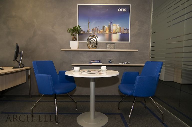
The designer has decided to refer to the products associated with a tenant, or elevators and escalators, through the arrangement of the materials used. Visiting the office, we come across different species of stainless steel, mirrors, glass, laminates and chrome. The company’s activity has emphasized also by finding in hallways and reception area posters presenting the prestigious buildings, using OTIS elevator. They also contain information about the number and types of elevators used in these objects.
Names of lift design, which uses the company OTIS, were the inspiration for the names of conference rooms, located in the office. The headquarters are, amongst others, Optima rooms, Selecta, Resista or Lumina. The more prestigious cabin, the greater the conference room, named in her honor.
An interesting element of the arrangement are wallpapers with a fragment of the Eiffel Tower with OTIS elevator, located in the toilets. It was a form of entertainment, the element "puzzle", and surprising employees. All these elements have created a consistent style and color organized completely, emphasizing the individual character of the interior of the office which we have created - explains the owner of the studio.
Cutest office OTIS
The current headquarters of OTIS in Warsaw has distributed on three floors of the building at st. Postęp and has occupied until 3000 sqm. surface. The new office is 1100 sqm. on one floor, characterized by modern design and arrangement of optimally combining open space and cabinets. The project has designed for people, so arranging the interior suggested that the equipment was not only comfortable, but also functional. Offered flexible spaces to encourage meetings, communication and greater integration of employees. All this meant that workers would happily moved into a new office - highlights Monika Saniternik, adding with a smile: Note that this is the cutest office OTIS, the Chairman of the Board saw was for us an extraordinary distinction.


